Guide
Graphic Design: Principles, Types, and a Practical Example
Use graphic design to make one message understandable: choose the information order, build a clear layout, and check the finished visual where people will see it.
By the Space Office team · Published · Updated · 16 min read
Graphic design is the practice of arranging text, images, color, and space to communicate a message to an audience. Start with what the viewer needs to understand, then use hierarchy, contrast, alignment, and spacing to guide attention. In Space Office, Boron can review visual hierarchy and Aluminum can prepare brand-consistent image assets. Hydrogen coordinates and reviews the work; a human verifies the facts, rights, and final appearance and approves release.

Key takeaways
- Define the audience, message, placement, and next action before opening a design tool.
- Use a clear information order; making every element prominent creates competition.
- Group related details and give them enough contrast, space, and readable type.
- Adapt the composition to each format instead of assuming one crop works everywhere.
- Review the exported asset at its intended size, with verified facts and an approved destination.
To connect a visual identity with a credible business promise, use the branding guide. Its ceramic-studio example turns customer evidence into a brief and checks the same direction across packaging, a product page, and customer messages.
Download the free graphic design brief and review worksheet to define the message, prioritize information, compare layouts, record source files, and review each export. The pottery workshop and its offer details below are fictional teaching examples. They are not a live event, customer project, or measured improvement.
What graphic design communicates
Figma’s introduction describes a field concerned with communicating through visual elements. A poster, product label, publication, or social graphic combines choices about words, imagery, type, and composition. The task is more specific than making something attractive: the viewer should be able to understand the intended message in the setting where the visual appears.
Consider a community pottery studio advertising an introductory workshop. A viewer needs to recognize the activity, decide whether it fits them, find the practical details, and understand the next step. A beautiful photograph cannot answer every one of those questions. The design must organize an accurate message around a useful customer task.
Scroll horizontally to view all columns.
| Type of work | Communication task | Typical output |
|---|---|---|
| Visual identity | Make related materials recognizable as belonging together. | A coordinated set of colors, type choices, marks, and usage examples. |
| Marketing graphics | Explain one offer or announcement to an intended audience. | A workshop poster, campaign image, or event card. |
| Editorial and information design | Help a reader navigate content and understand relationships. | A report layout, diagram, or instruction sheet. |
| Packaging and physical graphics | Present information on a real object or in a physical setting. | A label, package, sign, or printed handout. |
Graphic design also overlaps with other disciplines. A booking-page banner has a visual communication job, while the booking flow has interaction and usability requirements. A clear poster does not establish that a form works or that a person can complete a transaction. Keep those checks connected without treating them as the same deliverable.
If the underlying user problem is still unclear, the design thinking guide explains how to investigate it and test possible approaches. If the unresolved task is writing the message, start with the copywriting guide. This article focuses on arranging approved content into a useful visual.
Start with an accurate brief and a real viewing context
Write a compact brief before choosing fonts or collecting inspiration. Name the intended audience, the message they need to understand, where they will see it, and the action the business can actually support. A request to make an announcement more exciting leaves the most important communication decisions unresolved.
For the fictional studio, assume the approved offer is a beginner pottery workshop on 12 November from 6–8 pm, costing $45 with materials included. The owner has confirmed the workshop room and an approved booking page. These are teaching assumptions. A real brief would need the actual date, time zone where relevant, price conditions, location, suitability requirements, and available capacity.
- Audience: local adults considering a first pottery class; do not assume they understand specialist terms.
- Main message: a beginner can try making a small bowl in an instructor-led session.
- Required details: the approved date, time, price, inclusions, location, and booking route.
- Formats: a portrait phone graphic, a small printed poster, and a landscape website banner.
- Acceptance checks: the offer is understood, required details remain readable, and the next step leads to the correct approved page.
Collect the source material needed to make those decisions. Ask for the approved logo files, type and color guidance, usable photographs or illustrations, and any restrictions on editing them. Record which version of the offer is current and who can verify it. Do not let an outdated image folder quietly become the authority for the event details.
Describe the viewing context rather than only the export dimensions. A poster viewed across a reception area has different demands from a phone image inside a busy feed. A landscape banner may sit beside explanatory text, while a standalone announcement must carry more of its own context. Identify what information the surrounding page or caption provides.

Use graphic design principles to organize attention
Figma’s principles guide explains relationships such as hierarchy, contrast, alignment, and proximity. Use these as tools for a communication decision. They are not independent decorations to add to a finished page. In the workshop example, the aim is to connect the activity, practical details, and next action without making them compete.
Hierarchy establishes an information order. Give the workshop name a clear leading role, supporting details a consistent secondary role, and the booking instruction a recognizable action role. Size is one tool, alongside placement, weight, contrast, and surrounding space. If the price, logo, date, slogan, and photograph all compete for first attention, the viewer has to do the organizing work.
Contrast distinguishes elements. Dark text against a light background can separate the practical details from a photograph. A restrained accent can distinguish the booking instruction. Contrast should support the information order; assigning a different bright color to every line can erase that order. Check the actual foreground and background combination rather than judging isolated color swatches.
Alignment gives elements a shared structure. For the studio poster, a common left edge can connect the title, details, and action without a visible box around every item. Use a small grid or guides to make the relationships deliberate. A minor change in the width of a text block can improve the line breaks without changing the message.
Proximity and spacing show relationships. Keep the date and time together, group the price with its inclusion, and place the booking instruction where it follows the offer. Leave enough space between unrelated groups to distinguish them. Empty space gives the content room to work; it is not automatically wasted space that needs another icon or slogan.
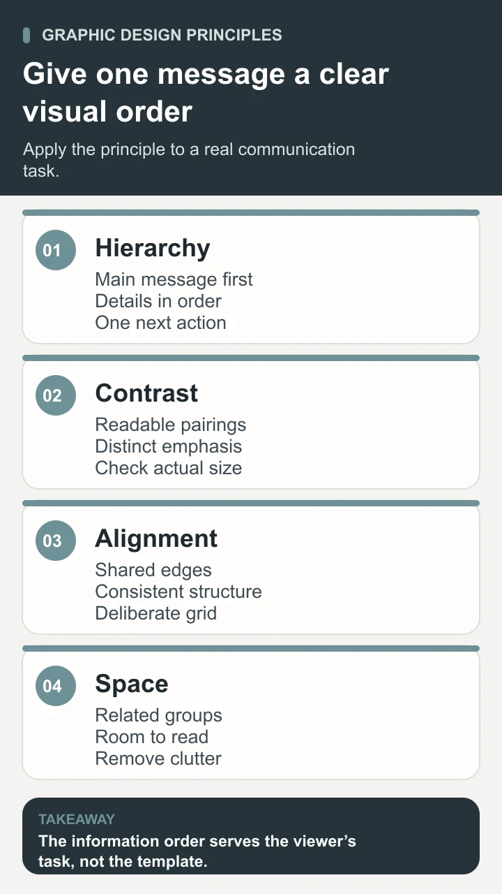
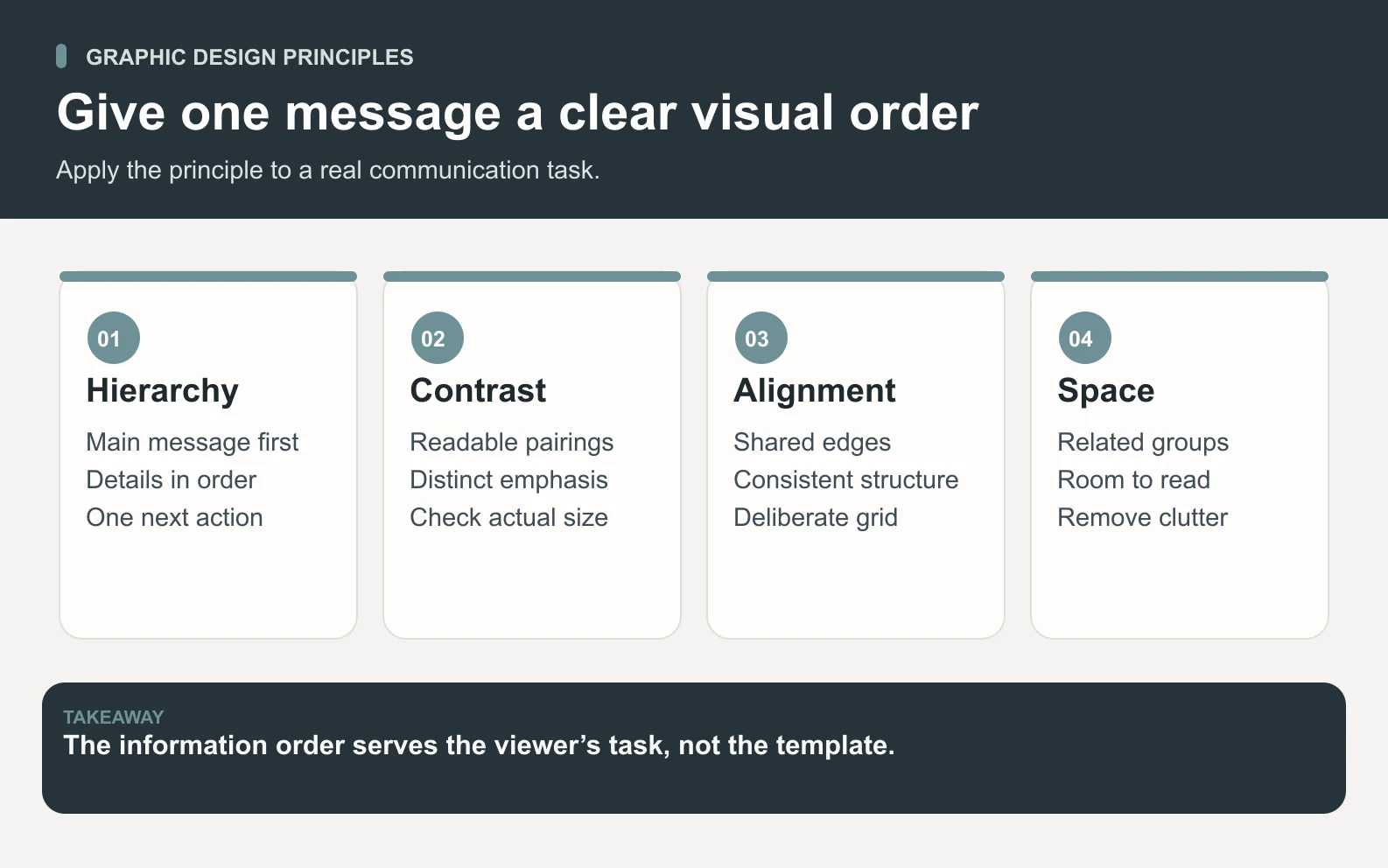
Typography involves more than selecting a font family. Set a readable size, suitable weight, practical line length, and clear line spacing. Compare actual words in the chosen typeface, including numbers in dates and prices. Avoid placing essential text over a busy image unless its background and contrast are controlled throughout the required crop.
IBM’s layout guidance treats composition as the relationship among elements within a space. Consistency helps a set of materials belong together: reuse an information order, type roles, image treatment, and a limited palette. Keep the system flexible enough to fit different amounts of content rather than stretching every design into an identical arrangement.
Worked example: turn a crowded workshop poster into a clear layout
Imagine the first draft contains a large studio logo, three decorative slogans, a photograph with text across it, and the date and booking instruction in small type at the bottom. The owner describes it as lively. That reaction is useful feedback about tone, but the review must also ask whether a new viewer can identify the class and find its essential details.
Begin the revision by removing information that has no clear job in this placement. Keep the approved workshop name, one useful image of the activity, the practical details, and one booking instruction. Move longer descriptions to the booking page when appropriate. Do not remove a condition the viewer needs simply to produce a cleaner-looking poster.
Scroll horizontally to view all columns.
| Element | Crowded draft | Proposed revision and reason |
|---|---|---|
| Headline | A slogan competes with a large logo. | Lead with “Beginner pottery workshop” so the activity is explicit. |
| Image | Multiple decorative photos sit behind text. | Use one relevant bowl or workshop image with an uncluttered text area. |
| Practical details | Date, time, and price are scattered. | Group 12 November, 6–8 pm, and $45 with materials included. |
| Next step | Several labels point in different directions. | Use one “Book a place” instruction tied to the approved page. |
| Brand cues | Many unrelated colors and type styles compete. | Retain a small, consistent set that fits the studio’s approved identity. |
Sketch two structurally different options before refining one. One might lead with the workshop name above the image; another might place a smaller image beside a clear information column. Compare how each handles the required details and the intended viewing size. Choosing a layout only because it fills a template can hide a mismatch between the content and the format.
Review the proposal with a neutral task. Ask someone in a relevant audience situation what the announcement is offering, when it happens, what the price includes, and how they would take the next step. Record what they find or misunderstand before explaining the layout. Treat this as a communication check, not as a measured claim about every potential customer.
Keep changes tied to the finding. If the price inclusion is missed, revise the grouping or wording and check again. If the person understands the poster but the booking destination gives a different time, correct the underlying content inconsistency. A visual revision cannot make an inaccurate offer trustworthy.
Adapt the layout and check readability in the final format
Build each required format from the same approved content and visual rules. A portrait graphic may stack the image and detail group. A landscape banner may put them side by side. A printed poster may need a clearer written booking route because a viewer cannot tap the design. Adapt the composition rather than cutting away whatever falls outside a crop.
Inspect the actual export at the intended display size. Zooming out inside an editor helps, but it does not replace viewing the file on a phone or checking a print proof. Look for small practical details, awkward line breaks, cropped marks, compressed images, thin text, and action instructions that disappear into the background. Recheck the destination and any QR code if one is used.
W3C’s explanation of WCAG contrast requirements gives a minimum ratio of 4.5:1 for normal text and 3:1 for qualifying large text, with stated exceptions. Use the definitions and test the real text/background pairing. A large heading in the source file may become small when the whole graphic is reduced. Contrast is one check; passing it alone does not establish overall accessibility.
For web publishing, keep essential information available as real page text where practical, with appropriate image alternatives. A poster image should not be the only place a reader can discover an important condition. Alt text should serve the image’s purpose in context; it should not become a pile of keywords or repeat nearby text without a reason.

Retain editable source files as well as exports. Keep image originals, approved type and color choices, dimensions, version, and review notes together. Ask the receiving colleague to confirm the required file format and placement behavior. A correct design exported with the wrong crop or missing source assets creates avoidable rework.
Prepare a reviewed Space Office visual packet
Give Space Office the approved brief, offer facts, audience and placement context, brand guidance, authorized source assets, format requirements, and acceptance criteria. Identify any missing facts or usage rights before asking for a finished visual. The person requesting the work should be able to say who owns the factual and release decisions.
Boron, the live creative-design specialist, can review visual hierarchy, UI/UX relationships, design consistency, and design QA. Aluminum, the live visual-content specialist, can prepare and optimize images and brand-consistent visual assets. Hydrogen coordinates and reviews the work against the brief. These contributions support a bounded design packet; they do not establish that every specialist discipline or production requirement has been covered.
For the studio, request two layout concepts, the chosen composition with its reasoning, approved image assets, the required format variants, and an export/review record. Ask the team to flag content that is missing, contradictory, or unreadable at the target size. Keeping an unresolved detail visible is more useful than filling the gap with an invented event condition.
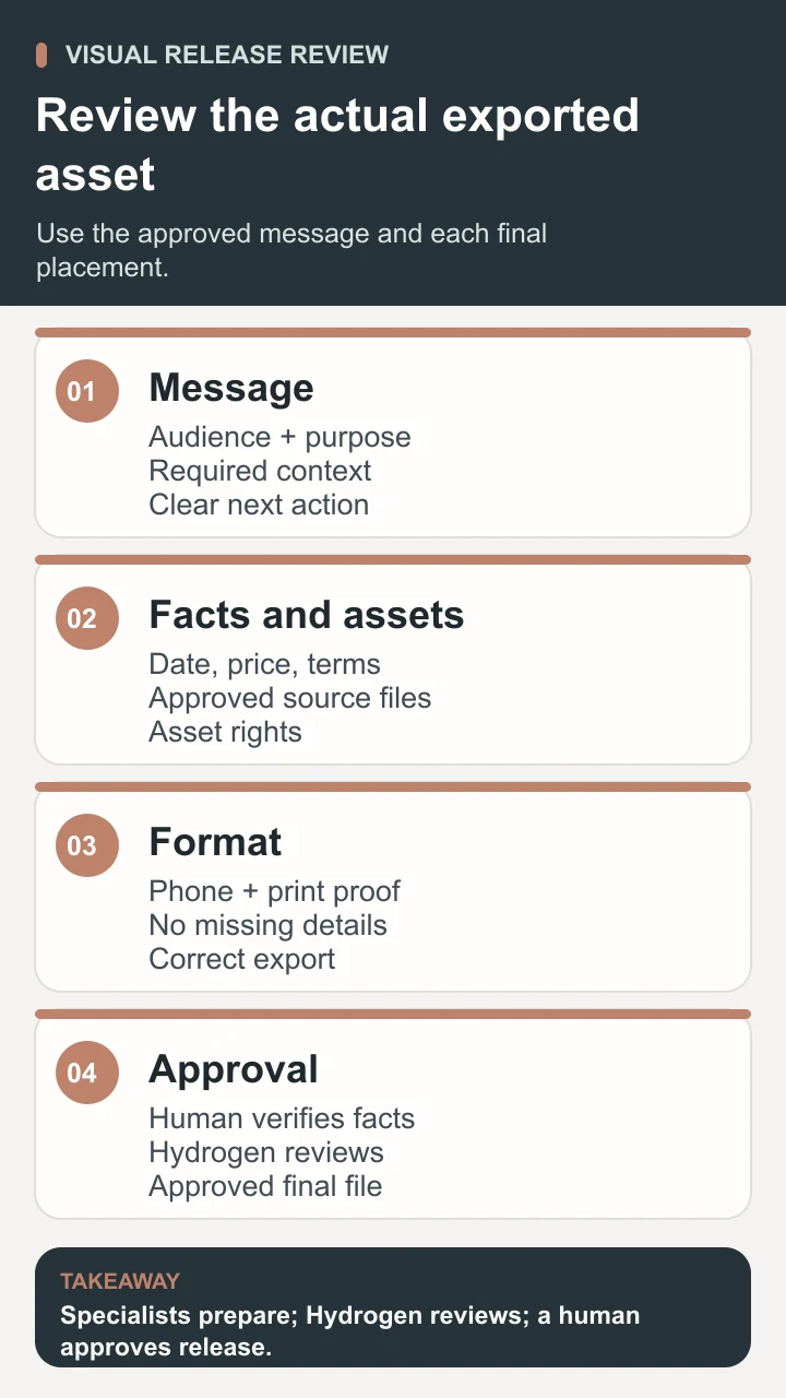
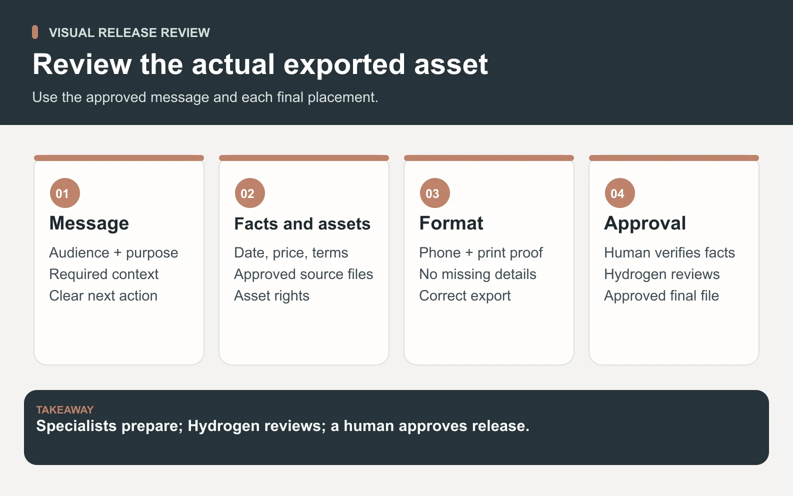
A human verifies the text, dates, price, conditions, destination, and rights; inspects the final versions; and approves publication or printing. Provide account or file access explicitly when needed. The Space Office agent roster and how the team works explain the live roles; contact is the route for assisted setup.
Review graphic design by the job it needs to do
Keep the final review concrete. Does the viewer understand the activity? Can they find the relevant details? Does the action lead to the approved place? Do the versions remain consistent without losing information? Record the exact exported version that passed these checks so an earlier draft is not accidentally used later.
After release, distinguish delivery checks from business outcomes. A correct uploaded file and working booking route confirm parts of the release. They do not prove that the design caused later bookings or recognition. If the business needs to compare outcomes, define an appropriate measurement plan and account for the audience, placement, offer, and other changes.
Update the system when a repeated issue appears. A recurring unreadable detail may call for a revised template or a stricter content limit. Repeated contradictory facts may require a better approval process. Improve the cause instead of asking each designer to patch the same problem in every export.
Useful graphic design makes an accurate message understandable in a real setting. Begin with the viewer’s task, organize the information, adapt the layout, and review the finished asset at its intended size. Keep the source files and human decision attached so the next version can be produced with the same clarity.
Sources and review notes
Reviewed against the linked primary sources on the checked dates. Search features and citations are selected by their respective platforms; no placement is guaranteed.
- Figma: What Is Graphic Design? — checked
- Figma: Graphic Design Principles — checked
- IBM Design Language: Layout Overview — checked
- W3C: Understanding Contrast (Minimum) — checked
Frequently asked questions
What is graphic design?
Graphic design is the practice of arranging text, images, color, and space to communicate a message to an audience. It includes decisions about information order, type, imagery, and composition. A useful design makes the intended content understandable in its actual print or digital setting.
What are common types of graphic design?
Common tasks include visual identity, marketing graphics, editorial and information layouts, packaging, and physical signs or handouts. The boundaries overlap. Choose the skills and deliverables around the communication problem, placement, and production requirements rather than assuming one specialist covers every kind of work.
Which graphic design principles should a beginner use first?
Start with hierarchy, contrast, alignment, and spacing. Decide what the viewer should notice first, distinguish important elements, give content a shared structure, and group related details. Then review the actual message and export at the intended size; applying a principle mechanically does not guarantee a useful result.
Do you need drawing skills for graphic design?
Drawing can help some projects, but many design tasks center on arranging type, existing imagery, and information. The required skill depends on the output. A clear workshop announcement may need strong composition and factual review, while an original illustration or specialized packaging project can require additional expertise.
Can AI help with graphic design?
AI can help prepare image assets, explore visual directions, and organize a review packet from approved material. A person still needs to verify facts, rights, readability, and the finished export. In this Space Office workflow, Boron and Aluminum prepare the work, Hydrogen reviews it, and a human approves release.